|  | Welcome to guidebook, a website dedicated to preserving and showcasing Graphical User Interfaces, as well as various materials related to them.
|  |
| |
| | Site last updated on 6th October 2006:
| |
| |
| | Seventeen exclusive Apple Lisa posters, free for download:
|  |  |
| |
| |
| | | Apple Lisa was the first commercial personal computer to be operated by a graphical user interface. Xerox Alto, the first GUI-based computer from the ’70s, was a research project, while Xerox Star and PERQ, both predating Lisa, were technically workstations. |
| |
| |
|
| | 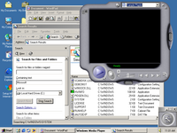 | The last Windows in 9x family and at the same time last Windows with only single appearance theme. Its slightly updated interface put more emphasis on home and multimedia use, but the operating system itself quickly got quite a bad reputation.
 |
| |
| |
| | 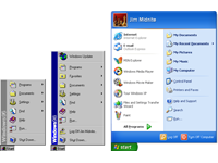 | It took Windows six years to go from a relatively simple Start menu in Windows 95 to one containing more than three times as many items in Windows XP. Is that the price of progress, or can application launching be done in some other way?
 |
| |
| |
| |  | If you dig deep enough, you’ll find this icon even in Windows XP, but it is far more likely you remember it back from Windows 3.x times. Program Manager (along with its sidekick, File Manager) replaced earlier MS-DOS Executive, only to be superseded by Explorer in Windows 95.
 |
| |
| |
|